
Mane Media
Scope: Brand identity development, logo design, visual system creation, and foundational brand assets for a modern photography and media company.
Mane Media was created as a bold, polished media brand built around visual storytelling, strong creative direction, and memorable imagery. The goal was to develop an identity that felt confident and professional while still maintaining a distinct personality.
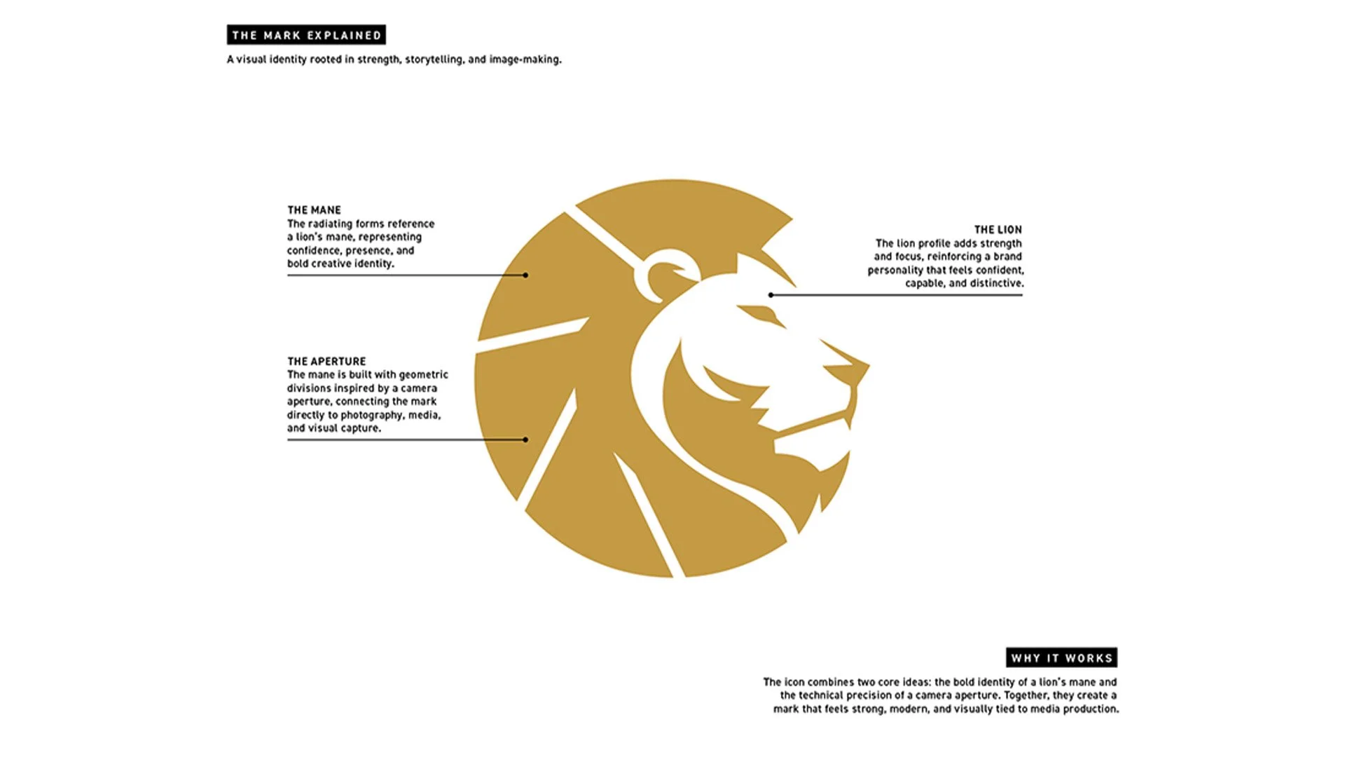
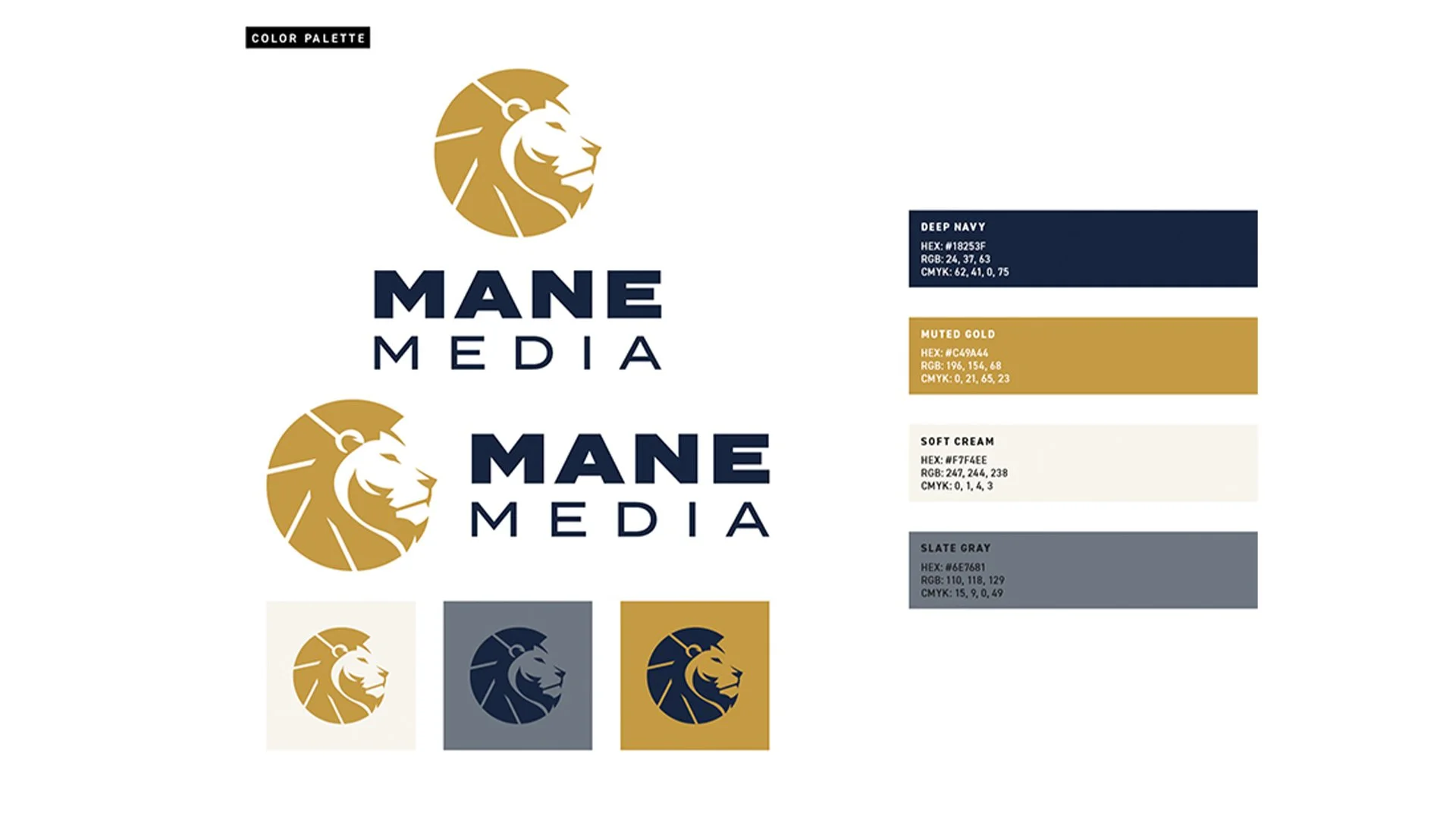
Working closely with the founder, the visual direction centered on the name “Mane” and its connection to strength, presence, and individuality. The final icon combines the profile of a lion with geometric forms inspired by a camera aperture, creating a direct link between the brand name and the company’s focus on photography and visual media.
The brand balances boldness with sophistication. The lion gives the identity confidence and recognition, while the aperture-inspired construction adds a technical, modern quality. Together, these elements create a mark that feels distinctive, versatile, and relevant to the media industry.
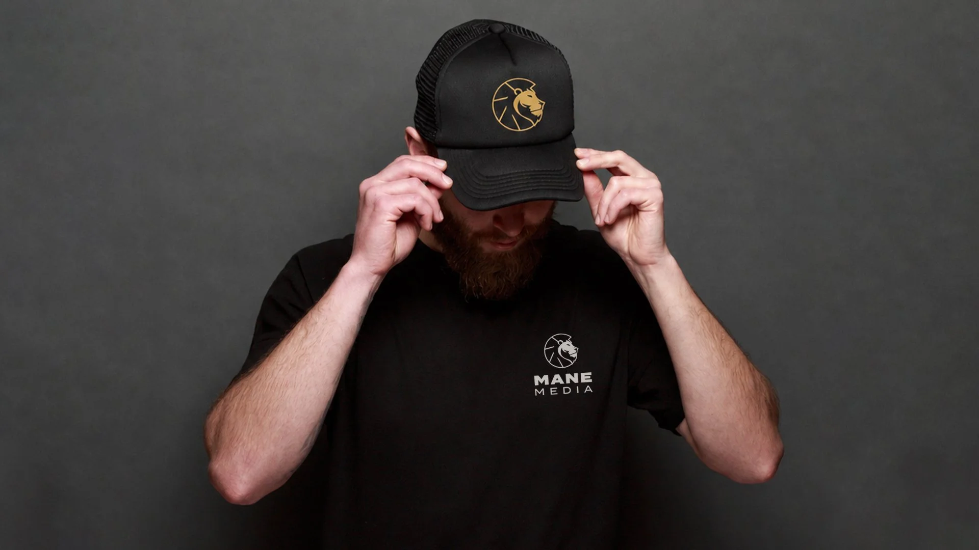
I led the creative direction and design of the brand identity, developing a visual system that could work across digital platforms, print materials, apparel, social media, and client-facing applications. The identity was designed to remain recognizable at both large and small scales, with a simplified icon that can stand alone when the full logo is not needed.
This work included:
Logo design and supporting icon system
Brand typography and color palette
Foundational brand guidelines
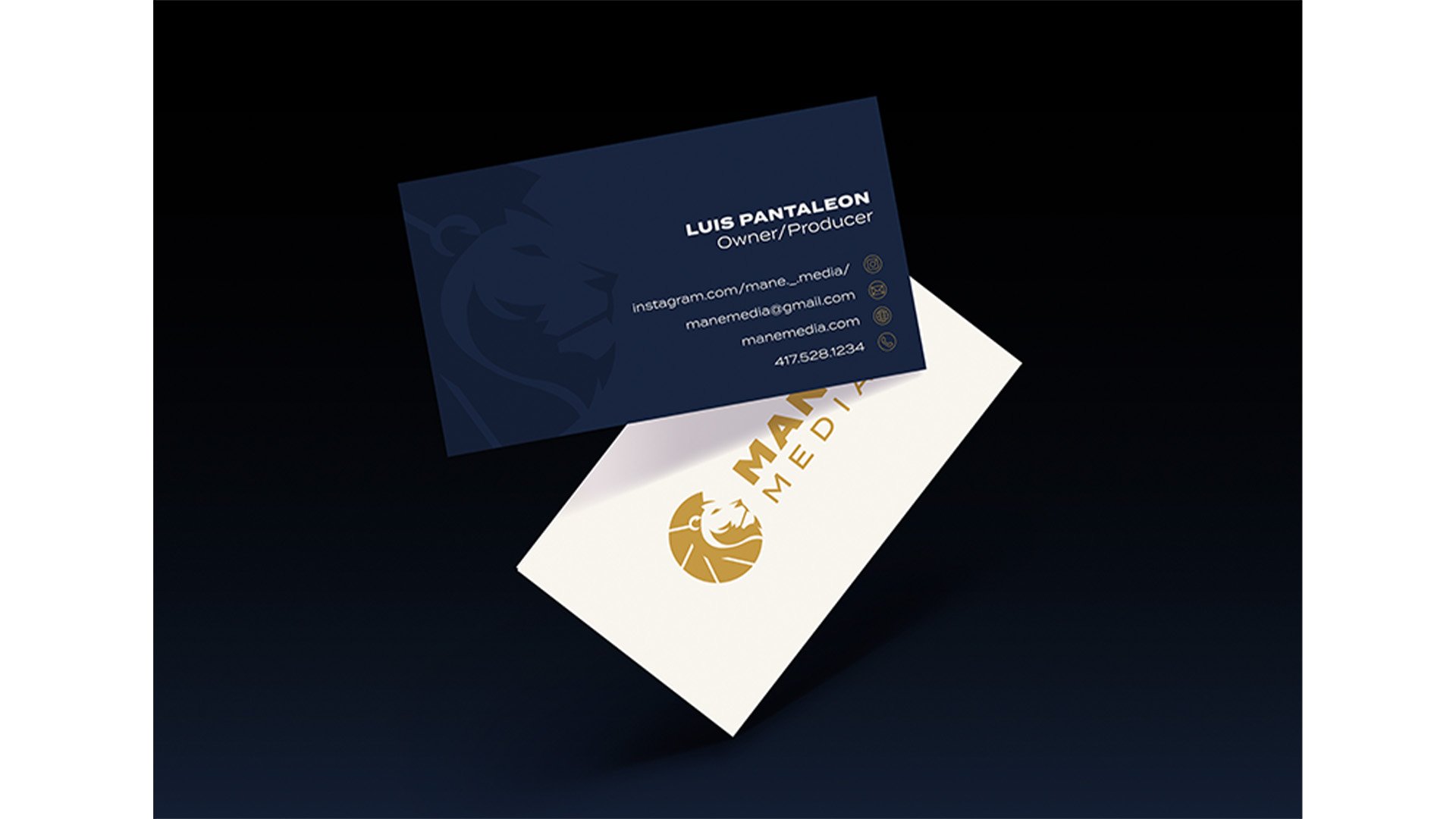
Business card and contact icon design
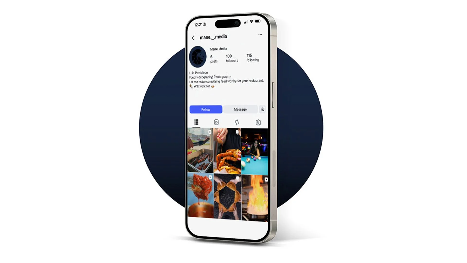
Social media and digital applications
Apparel and merchandise mockups
Print-ready and digital brand assets
The resulting identity positions Mane Media as a confident, modern, and professional creative brand. It gives the company a strong visual foundation while allowing the work and photography to remain the focus.